
How to animate in tailwind
Tailwind CSS is a utility-first CSS framework that has shown tremendous growth in its adoption, making it a popular choice for all your styling needs. In this blog, we create an animation in a React application using tailwind css.

How to animate in tailwind
In this blog, we talk about implementing animations using Tailwind CSS. To understand how animations are created in CSS, visit our blog how to animate in CSS
Why do people like tailwind?
Tailwind is a utility-first CSS framework that is very popular for its flexibility and ability to build complex user interfaces. It can build the framework easily without writing little to no custom CSS. In tailwind, we have utility classes for padding, margin, etc. These utility classes are reusable. This prevents us from creating a new class every time to style some elements which have many properties in common and majorly,coming up with a new name every time.
What we will be making?
To get hands-on knowledge of using animations in tailwind, let's create the below animation.
Let us list down the requirements:
- We have a UI with a sword icon and a line going through it.
- The sword icon should be spinning continuously.
- The sword should slide from one end to another.
- The sword should stay at both ends for 1 second before moving to another.
Installation and setup
We will be creating this in a React application using Tailwind CSS. Follow the steps mentioned here in tailwind official docs to get a react project created with tailwind CSS installed.
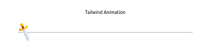
After we have a project ready, let's get the static part of the UI created without any animation. We will be creating a separate SwordAnimation component and using it in our App.js. As you can see, in this UI we have:
- A heading - Tailwind Animation
- A sword icon
- A line in the center
Below is the code for this:
App.js
SwordAnimation.js
I have used the sword icon from flaticon.com, just for fun. But you can use any icon you want or just a simple div with a width and height.
At this point, you should have the basic UI structure ready - without any animation like below:
.png)
Now let us add animation to it.
Predefined animations in Tailwind
Tailwind comes with 4 predefined animations.
- Spin - to add a linear spin animation to elements
- Ping - to make an element scale and fade
- Pulse - to make an element gently fade in and out
- Bounce - to make an element bounce up and down
Most of the time, these animations would be enough for any use case. But in case we want to modify these predefined animations or add a completely new animation, tailwind allows us to do that as well. We will be doing this in a short time.
For our animation, we need the spinning effect to spin our sword. Luckily, tailwind has it ready for us. We just have to use it.
To use any of the above-mentioned animations, we just have to add the respective class name along with the ‘animate-’ prefix. In our case, we will be adding the class animate-spin to our img tag.
Now, we have a spinning animation applied to the element.
.gif)
Until now, we have completed the first two requirements of our final animation. Now, we just need to add the sliding animation to our sword to move it from one end to another along with a pause at both ends. But hey! I don’t see any sliding animation provided by tailwind. Don’t worry, people at Tailwind were kind enough to make it as customizable as possible so that we can add our own animations as well.
Adding custom animations
Before creating our own sliding animation, let’s see, for a moment, what our sliding animation requires. Let's start with the basic sliding animation without any pausing effect at the ends.
At 0s, our sword is at the initial position i.e. the start of the line.
At 1s, our sword is at end of the line.
At 2s, our sword is back at the start of the line.
With this, we get to know that our animation would be of total 2 seconds, and we would be changing its x-coordinate.
Now, in pure CSS we would do it like below:
Note : translateX(calc(600px - 100%)) because we have set the container width in App.js to 600px and we need to subtract the sword icon’s width from it to prevent it from going out of the container.
Now, to add this same animation in tailwind theme, we will be making changes in tailwind.config.js file. To add any new keyframes, we need to add it as a value inside the keyframes object of theme.extend or theme like below:
Along with that, we need to add a key-value pair inside the animation object as well where the key is classname of the animation we just created and the value would be the animation name along with its properties.
After this, we can use our class by adding class animate-slide to any element we want. Note that we need to use ‘animate-’ prefix here as well.
Now that we have created our own animation, it's time to use it inside our own sword component. But before doing that, note that we already have the spinning effect applied to the img tag which changes its transform property. If we just add our new animate-slide class after animate-spin class, it would override it as animate-slide is also changing the same transform property of img tag.
To avoid this, we will be adding our animate-slide class to its wrapper element i.e. the <figure> tag.
Voila! We are almost done with our animation.
.gif)
The only thing remaining now is to add the pause effect at both ends. Let’s do it!
Adding pause effect between iterations
The important thing to note here is, we need a delay between two iterations of an animation cycle and not just a delay at the beginning. Which is why, using animate-delay won’t solve our problem.
The way to do this is, by increasing our animation’s total time and completing the sliding effect at half the time, and making no change for the rest of the time. Let me break it down:
At 0s, our sword is at the initial position.
At 1s, our sword should still be in the same position.
At 2s, our sword should slide to the other end.
At 3s, our sword should stay there
At 4s, our sword should return back at the initial position.
This way our sword would stay at both ends for 1s before sliding to another. Let’s make these changes in our animate-slide animation. The updated animation would look like:
The animation is now ready.


